MASORANGE
Merger of Corporate Identities

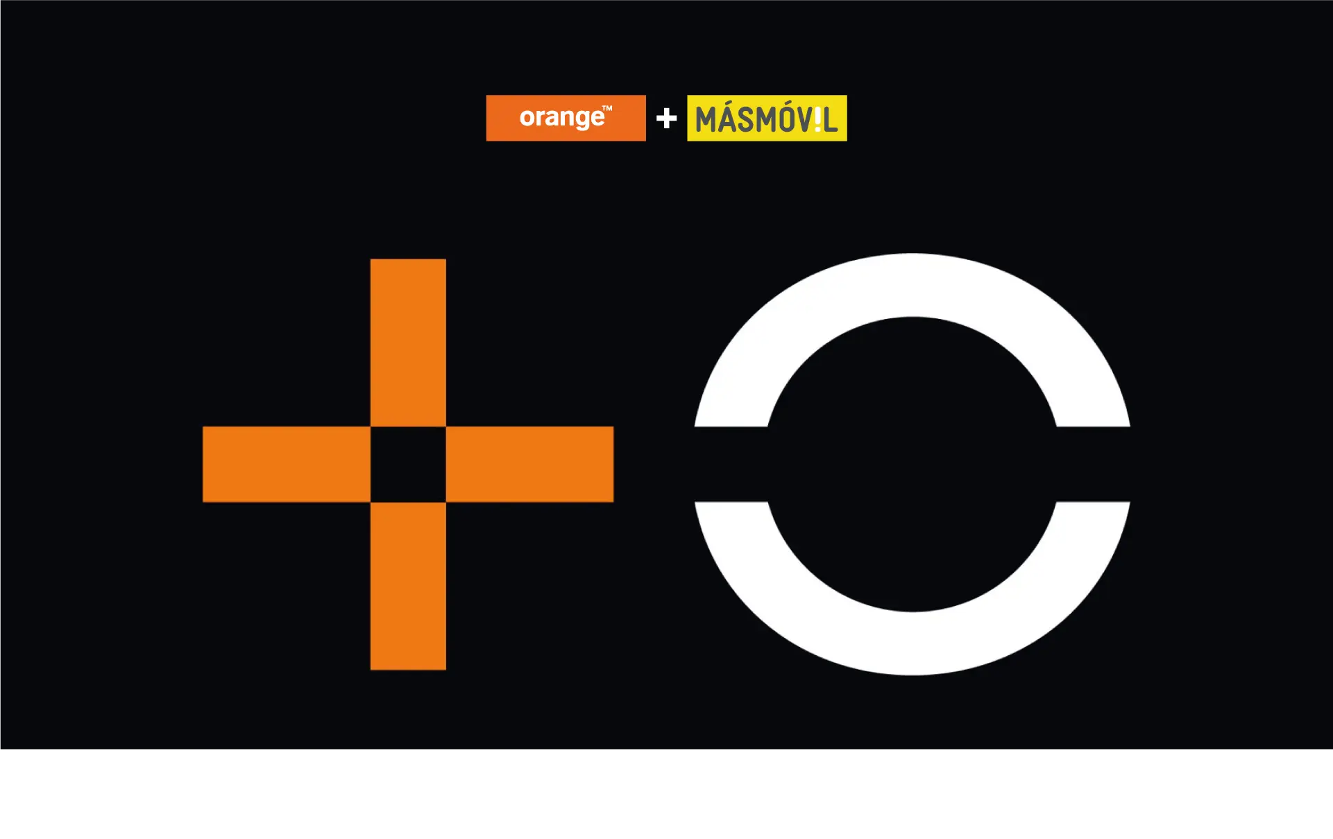
MásMóvil and Orange They are joining forces to lead the telecommunications market. Their new corporate identity is unveiled: MASORANGE.
The New Corporate Identity
The new identity proposes a combination of personalities from the previous brands. It aims to convey its core values through:
- Unión: Masorange es el resultado de la unión de dos grandes empresas motivadas por la innovación y la confianza.
- Innovación: Masorange está comprometida con la innovación en el sector de las telecomunicaciones. Su nuevo símbolo lo refleja.
- Cercanía: Quieren ser una marca cercana a sus clientes. Un equipo conformado por personas para dar servicios a otras personas.
- Confianza: Masorange quiere ser una empresa que ofrezca garantías a sus consumidores.
New Isotype
The purpose of this new symbol/isotype is to house the essence and personality of both brands in a single identity, focused on innovation and consumer trust.
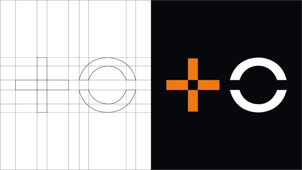
The new symbol consists of two elements:
- The plus sign (+) in MásMóvil’s logo is meant to symbolize unity and inclusion—that there is room for everyone and that everyone contributes. It consists of the geometric shape of the plus sign. The intersection of these shapes creates a negative space in the form of a square.
- The letter O in Orange, which represents the world and global connection. It is formed by two vertically oriented parentheses. The letter O is divided horizontally by a straight line that matches the thickness of the geometric shapes in the plus sign.
New corporate colors
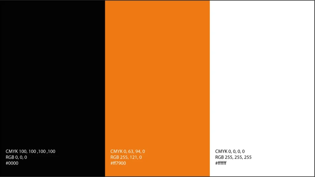
Orange and white refer to Orange and MásMóvil, respectively, against a black background. Black represents seriousness and trust, white represents simplicity and transparency, and orange represents energy and vitality. It should be noted that on their website, they occasionally use the yellow color from the old MásMóvil logo.
Typography:

Very similar to the "giant" HelvéticaThey haven't overcomplicated things. It's a sans-serif typeface, modern and legible, and it conveys a sense of approachability and accessibility. It greatly facilitates reading and understanding the brand.
CONCLUSION OF THIS ARTICLE
Overall, the new MASORANGE brand has a positive balance in terms of the simplicity of its design and its consistency with the values of the brands involved. They place considerable emphasis on offering the best user experience with cutting-edge technology, global connectivity, and a strong commitment to sustainability. Orange has published reports and annual reports on its ESG (Environmental, Social, and Governance) sustainability programs, which makes the public's interest in the brand-user relationship quite interesting. However, caution is advised in this area, as many companies hide behind greenwashing, a harmful practice of making their audience believe they are doing everything possible to care for the planet, resources, employees, etc., when in reality it's pure marketing.
Regarding the visual aspect, I must admit that simplicity and minimalism are going too far. Sometimes less is more, but not always; a more nuanced approach is necessary. brand strategy that can guide you in deciding how to best identify your brand. I would have liked to see a more playful symbol, colors with more personality, and a subtle nod to its previous incarnations. ➕️⭕️
Do you want to work on your brand identity? Contact me here!